Bug #5068
closed
font size of silk screen is too small
Added by laforge about 3 years ago.
Updated about 3 years ago.
Description
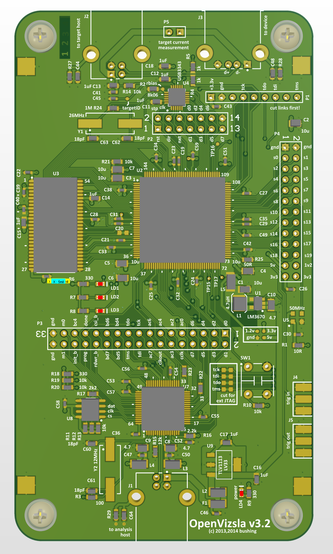
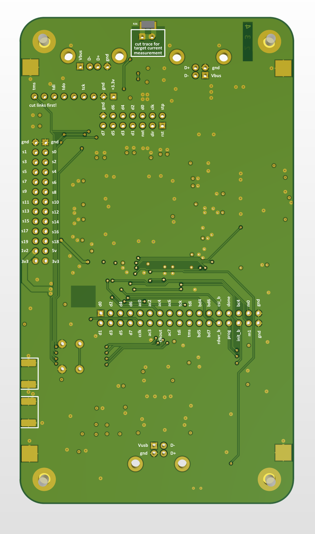
The minimal silk screen strok width of the PCB house we want to use is 0.17mm (7mil) and the minimal character height is 1mm. Let's adjust the design accordingly.
Files
- Assignee changed from mschramm to cibomahto
Minimum line width has been improved there to 0,1 mm (4mil), so you don't have to stick to 0,17mm. Let's take something like 1mm by 0,12mm as minima. - Silk screen is clipped when closer than 0,1mm to a solder mask opening, so maintain that minimum clearance.
Note that most of the silkscreen text is using the TrueType font 'Calibri'
- Added DRC rule: Manufacturing->silk to soldermask clearance = 4mil
- Increased text height to a minimum of 1mm
- WIP: re-arranging text to fit
If it's easier, you can go for a vector font and leave the TTF, their sharp corners won't get printed anyways, and a vector font always has rounded caps. So especially on these small sizes when it comes to the lower boundaries of printing solution, this looks better.
- Status changed from New to In Progress
- Status changed from In Progress to Resolved
- % Done changed from 0 to 100
cibomahto wrote:
I'd finished the layout before I saw your note, so the text labels are still using the Calibri font.
No problem, so we'll experience 'analog rounding' anyway ;) .
Also available in: Atom
PDF